Companies, as they grow to become multi-billion-dollar entities, somehow lose their vision. They insert lots of layers of middle management between the people running the company and the people doing the work. They no longer have an inherent feel or a passion about the products. The creative people, who are the ones who care passionately, have to persuade five layers of management to do what they know is the right thing to do. - Steve Jobs
I don't typically write about Apple stuff. It's the most written-about company on earth. Every product launch gets the kind of forensic scrutiny normally reserved for plane crashes and celebrity divorces.
Mostly though, I feel like a line cook at a Denny's talking trash about whether the French Laundry has lost their way. I'm back here microwaving a Grand Slam and opining about Thomas Keller's sauce work. The engineers I know personally at Apple are, on average, much more talented than me. They work harder, they do it for decades without a break, and none of them have ever shipped a feature while still wearing pajama pants at 2 PM. It seems insane for someone of my mediocre talent to critique them.
It also feels a little dog-pile-y. Apple employees know Tahoe sucks. They know it the way you know your haircut is bad — they don't need strangers on the internet confirming it. And to be fair, there's genuinely great work buried inside Tahoe: the clipboard manager, the automation APIs, a much-improved Spotlight. But visually it's gross, and that matters when your entire brand identity is "we're the ones who care about design."
Instead, I want to talk about a bigger problem and one that I do feel qualified to talk about because I am very guilty of committing this sin. I don't see a cohesive vision for MacOS and WatchOS. This, more than one bad release, seems far worse to me and dangerous for the company. Since this is already 2000 words as a draft I'll save WatchOS for another time. I'm verbose but even I have limits.
Now to be clear this isn't across every product. iPadOS has a strong vision and have the strength of their convictions to change approaches. The different stabs at solving the window problem inside of the iPad and make it so that you still have an iPad experience while being able to do multiple things at the same time is proof of that. iOS has an incredibly strong vision for what the product is and isn't and how the software works with that.
VisionOS and tvOS are less strong, but visionOS is still finding its footing in a brand new world. The Apple TV hardware and software is in a weirdly good position even though nothing has changed about it in what feels like geological time. I've purchased every version of the Apple TV, and with the exception of that black glass remote — the one that felt like it was designed by someone who had never held a remote, or possibly a physical object — everything has been pretty good. I'm still not clear how storage works on the Apple TV and I don't think anybody outside of Apple does either. I'm not even sure Apple knows. But somehow it's fine.
But with watchOS and MacOS we have 2 software stacks that seem to be letting down the great hardware they are installed in. They seem to be evolving in random directions with no clear end goal in mind. I used to be able to see what OS X was aiming for, even if it didn't hit that goal. Now with two of Apple's platform I'm not able to see anything except a desire to come up with something to show as this years release.
OS X Has An Opinion
When I got my first Mac — an iBook G3 — the experience was like test-driving a Ferrari that someone had fitted with a lawnmower engine. You'd click on the hard drive icon and wait. And wait. And in those few seconds of waiting, you'd think: man, this would be incredible if the hardware could keep up. The software had somewhere it wanted to go. The hardware just couldn't get it there yet.
This trend continued for a long time on OS X, where you'd see Apple really pushing the absolute limits of what it could get away with. After the rock solid stability of 10.4 Apple took a lot of swings with 10.5 and they didn't all land. The first time you opened the Time Machine UI and the entire thing crawled to an almost crash, you'd think boy maybe this wasn't quite ready for prime time. But this entire time there wasn't really a question, ever, that there was a vision for what this looked like.
The progression of OS X from the beta onward was this:
- It's Unix, but you never need to know that. All the power, none of the beard. You get the stability of a server OS without ever having to type
sudointo anything. - Everything annoying is abstracted away. Drivers? Gone. "Installing" an application? You drag it into a folder. That's it. That's the install. It felt like the computer was meeting you more than halfway — it was practically doing your job for you and then apologizing for not doing it sooner.
- If it seems like it should work, it works. Double-click a PDF, it opens. Put in a DVD, it plays. Drag an app to the Applications folder and it becomes an application. This sounds obvious now, but in 2003 this was like witchcraft if you were coming from Windows.
- But it was also serious. It wasn't cluttered with stupid bullshit. It was designed for people who made things — with real font management, color calibration, the works. The OS tried to stay out of your way. Your content was the show; everything else was stagecraft.
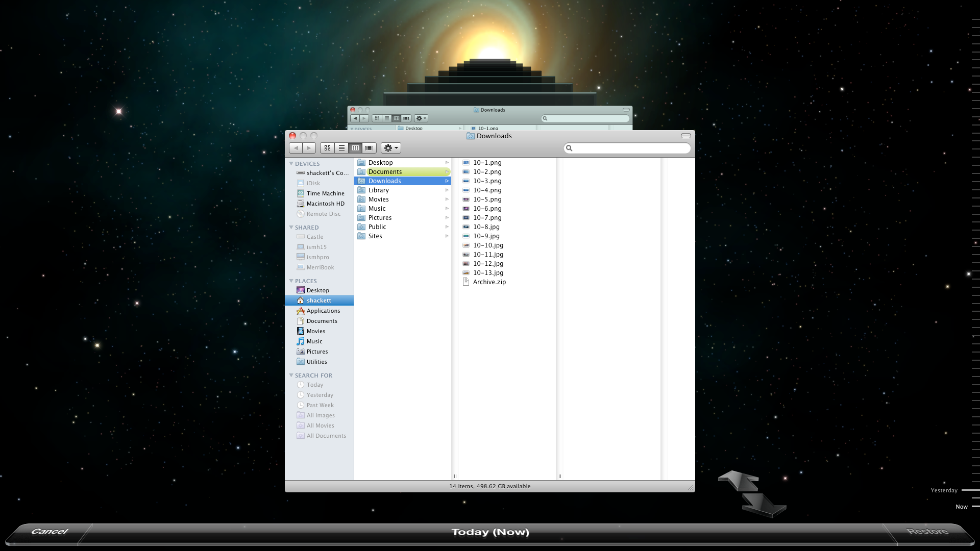
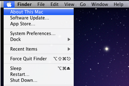
OS X tried to accommodate you, not the other way around. When you look at these screenshots I'm always surprised how light the touch is. There isn't a lot of OS here to the user. Almost everything is happening behind the scenes and the stuff you do see is pretty obvious.
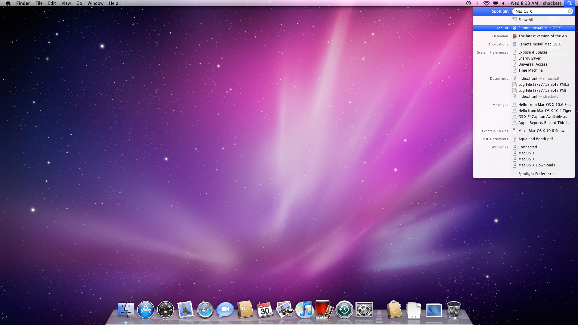
The first time I thought "oh man, they've lost the thread" was Notifications. On iOS, Notifications make sense — you've got apps buried in folders three screens deep, so a unified system for surfacing what's happening is genuinely useful. On macOS, this design makes absolutely no sense at all. You can see your applications. They're right there. In the Dock. Which is also right there.
This is the beginning of this feeling of "we aren't sure what we're doing here with the Mac anymore". iOS users like Notifications so maybe you dorks will too? It consumes a huge amount of screen real estate, it was never (and still isn't) clear what should and shouldn't be a notification. Even opening up mine right now it's filled with garbage that doesn't make sense to notify me about. A thing has completed running the thing that I asked it to run? Why would I need to know that?
There is also already a clear way to communicate this information to me. The application icon adds an exclamation point or bounces up and down in the dock. With Notifications you end up with just garbage noise taking up your screen for no reason. Maybe worse, it's not even garbage designed with the Mac in mind. It's just like random crap nobody cares about that looks exactly like iOS Notifications.
The issue with copying everything from iOS is that it's like copying someone's homework — except they go to a different school, in a different country, studying a different subject. It's not just wrong in the way where you tried and failed. It's wrong in a way that makes everyone who encounters it deeply uncomfortable. The teacher doesn't even know where to begin. They just stare at it.
For years afterwards it seemed like the purpose of MacOS was just to port iOS features to the Mac years after their launch on iOS. Often these didn't make much sense or hadn't had a lot of effort expended in making them very Mac-y. Like there was clearly a favorite child with iOS, then a sassy middle child with iPadOS and then, like a 1980s sitcom where there was a contract dispute, "another child" you saw every 5th episode run down the stairs in the background with no lines. Me at home would shout at my TV "I knew they didn't kill you off MacOS!".
Now with Tahoe there's clearly some sort of struggle happening inside of the team. And here's what's maddening — buried inside this visual catastrophe, someone at Apple is doing incredible work. Clipboard management has been table stakes in the third-party ecosystem for years. Apple finally added a version that handles 90% of use cases. It's classic Sherlocking: Apple shows up ten years late to the party, brings a decent bottle of wine, and somehow half the guests leave with them.
Same with Spotlight. Spotlight hasn't gotten a ton of love in years. Suddenly it's really competing with third-party tools. If you're searching for a file, you can filter it based on where the file is stored. Type "name of Directory" press the Tab key, and then type the name of the file before pressing Enter. This is great! We finally have keyword search for stuff like kind:reminder. Application shortcuts for opening stuff with things like ff for Firefox is nice. Assign a quick key like “se” to Send Email. Type it in Spotlight, hit enter, and compose your message.
This is all classic Apple thinking which is "how can we make the Mac as good as possible such that you, the user, don't need to download any third-party applications to get a nice experience". You don't need a word processor, you have a word processor and a spreadsheet application and presentation software and a PDF viewer and a clipboard manager and a system launcher and automation APIs etc etc etc. This is a vision that is consistent throughout the entire systems history, how can we help you do the things you need to do more easily.
But the reason why I'm stressed as someone who is pretty invested in the ecosystem is that the visual stuff is so bad and not just bad, but negligent. We didn't test how it was gonna look under a bunch of situations so that's now someone else's problem. Whenever I get a finder sidebar covering folder contents so I had to resize the window every time, or the Dock freaks out and refuses to come back out, it feels like I installed one of those OS X skins for a Linux distro. I buy Apple stuff cause its nice to look at and this is horrible to look at.
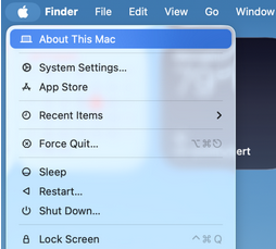
Why is this so big? Why did you cut off the word "Finder" from Force Quit? Everywhere you look there's a million of these papercuts. We have a resolution on our laptops screen that would have made people collapse in 2005 why must we waste all of it on UI elements? Also you can't grab window edges as shown by the best post ever written here: https://noheger.at/blog/2026/01/11/the-struggle-of-resizing-windows-on-macos-tahoe/
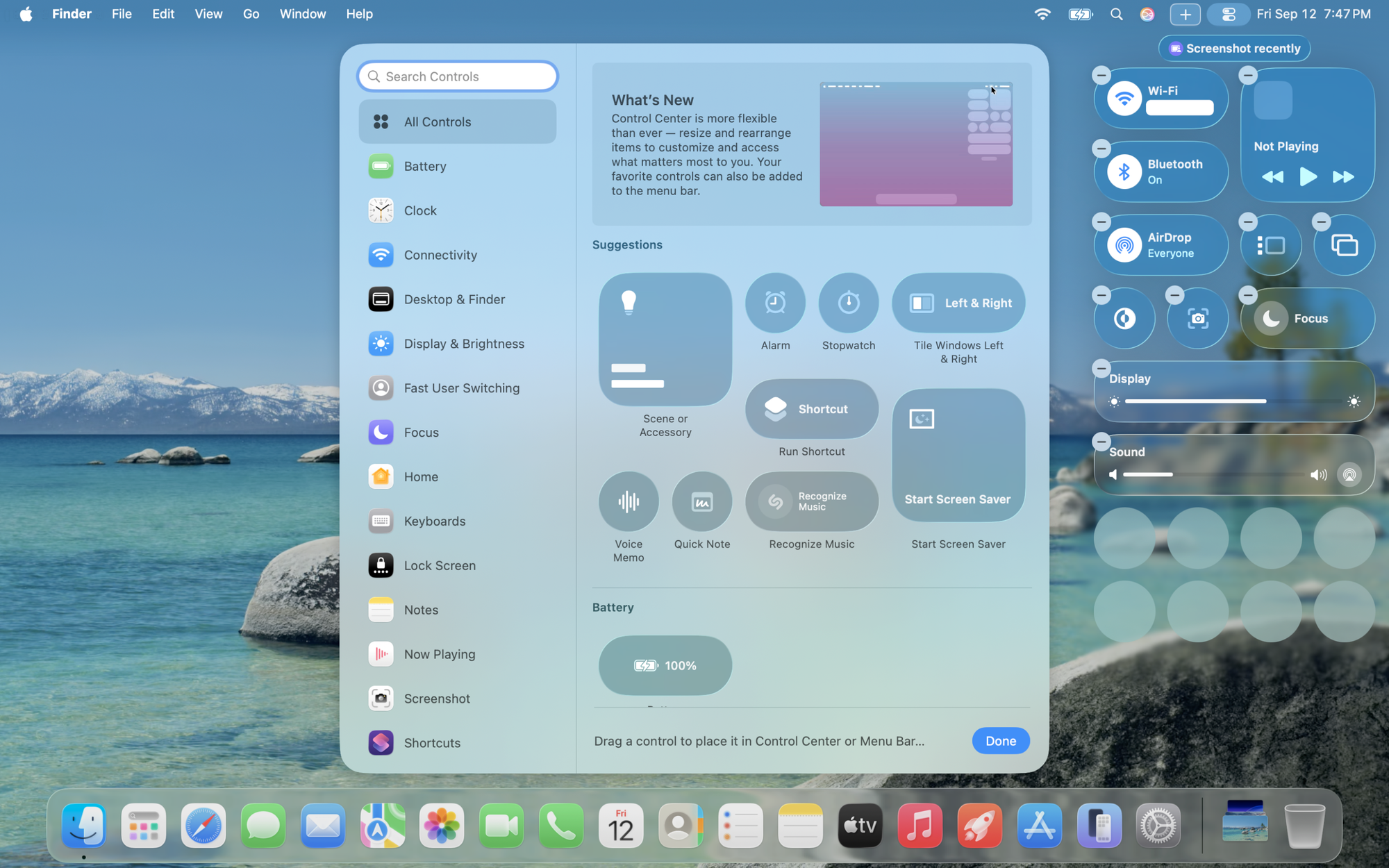
Why is there so much empty space between everything? Why are there six ways to do literally everything? Why did we copy the concept of Control Center from iOS at all if there's very little limit on screen real estate and we could already do this from the menu bar? So we're going to keep the Mac menu bar but we're going to add a full iPad control system and then we're going to use the iPad control system to manage the menu bar.
I will say the "Start Screen Saver" makes me laugh because its a mistake I would make in CSS. The text is too long so the button is giant but we didn't resize the icon so it looks crazy. Now do we need the same text inside the button as outside of it? No, and that leads me to the other banger. It's pretty clear the two white boxes inside of "Scene or Accessory" were supposed to be text, Scene on the top and then Accessory on the bottom, but SwiftUI couldn't do that so they left the placeholder. Somewhere there is a Jira ticket to come back to this that got trashed.
Also, complete aside. Has anyone in the entire fucking world ever run Shazam from a Mac? What scenario are we designing for here? I hear a banger at the coffee shop so I hold my MacBook Pro up over my head like John Cusack in Say Anything, hoping it catches enough audio before my arms give out? "Recognize Music" is in my menu bar, taking up space that could be used for literally anything else, on the off chance I need to identify a song using a device that weighs four pounds and has no microphone worth using in a noisy room. If you are going to copy ipadOS's homework you need to think about it for 30 seconds.
So my hope is that the improvement camp wins. That the people who built the better Spotlight and the clipboard manager and the automation APIs are the ones who get to set the direction. Because right now it feels like the best work on macOS is being done in spite of the overall vision, not because of it. Like someone's sneaking vegetables into a toddler's mac and cheese. The good stuff is in there — you just have to eat around a lot of neon orange nonsense to find it.
Steve Jobs talked about creative people having to persuade five layers of management to do what they know is right. I don't know how many layers there are now. But I know what it looks like when the creative people are losing that argument, and I know what it looks like when they're winning it. Right now, on macOS, it looks like both are happening at the same time, in the same release, on the same screen. And that's scarier than any one bad design choice.