An opinionated take on the tool I use the most
Like many of you, my terminal emulator is probably my most used piece of software. My day begins with getting a cup of coffee, opening up Slack and iTerm 2, my terminal emulator for years. iTerm 2 has an incredible number of features, almost too many to list. Here are some of my most-used features just off the top of my head:
- Hotkey global terminal dropdown, meaning I can get into the terminal from any application I'm in
- Really good search, including support for regex
- Paste history, which like come on who doesn't use that 100 times a day
- Password manager. With the death of sudolikeaboss I've come to rely on this functionality just to deal with the mess of passwords that fill my life. Also if you know a replacement for
sudolikeabossthat isn't the 1Password CLI let me know. - Triggers, meaning you can write basic actions that fire when text matching a regex pattern is encountered. Nice for when you want the icon to bounce in the dock when a job is done in a dock or when you want the password manager to automatically open when a certain login prompt is encountered.
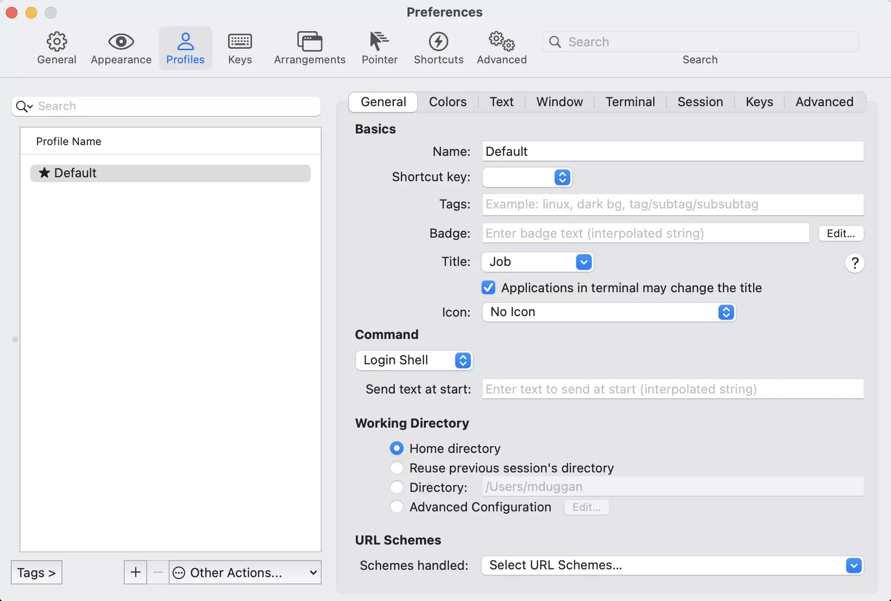
With all this flexibility comes complexity, which smacks you in the face the second you open the Preference pane inside of iTerm 2. I don't blame the developers for this at all, they've done a masterful job of handling this level of customization. But I've seen new users jaw drop when they click around this preference pane:
I have very few complaints with iTerm 2, but I'm always open to try something new. Someone on Twitter told me about Warp, a new terminal emulator written in Rust with some very interesting design patterns. I don't know if its the right terminal for me but it definitely solves problems in a new way.
What makes a good terminal emulator?
This is a topic that can stir a lot of feelings for people. Terminal emulators are a tool that people invest a lot of time into, moving them from job to job. However in general I would say these are the baseline features I would expect from a modern terminal emulator:
- Control over color, people don't all have the same setups
- Tabs, they're great in browsers and even better with terminals
- Profiles. Different setups for different terminals when you are doing totally isolated kinds of work. I like a visual indicator I'm working in production vs testing, for instance.
- Access to command history through the tool itself
- Bookmarks, while not a must-have are nice so you don't need to define a ton of bookmarks in your bash profile.
- Notifications of some sort.
- Control over fonts. I love fonts, it's just one of those things.
So why am I reviewing a terminal emulator missing most of these features or having them present in only limited configurations? Because by breaking away from this list of commonly agreed-upon "good features" they've managed to make something that requires almost no customization to get started. Along the way, they've added some really interesting features I've never seen before.

I requested an invite on their site and a few weeks later got the email inviting me to download it. First, huge credit to the Warp team. I respect the hell out of software with an opinion and Warp has a strong point of view. The default for development tools is to offer options for everything under the sun and to see someone come to the conversation with a tool that declares "there is a right way to do this" is intriguing. Here is what you see when you open warp:
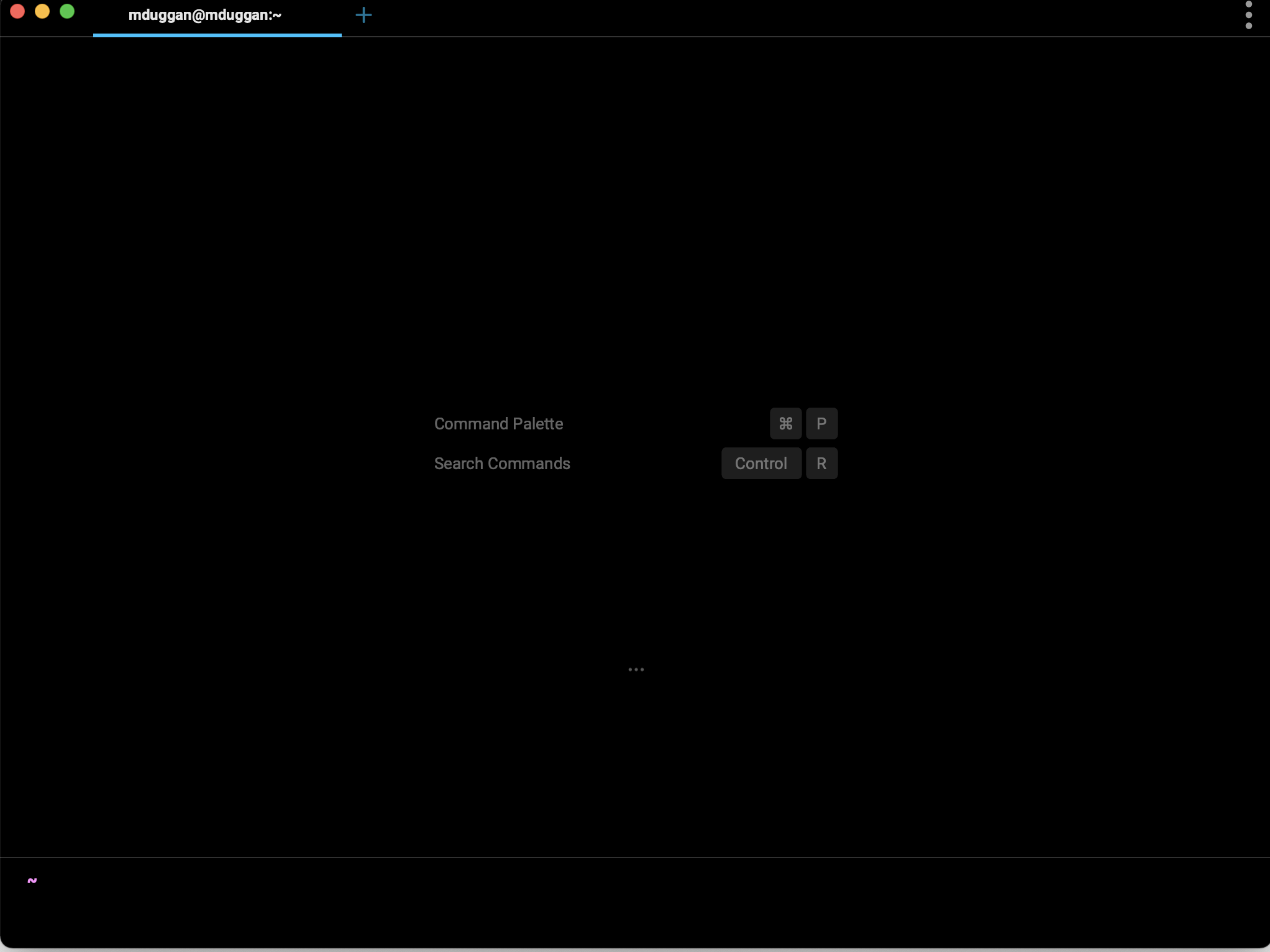
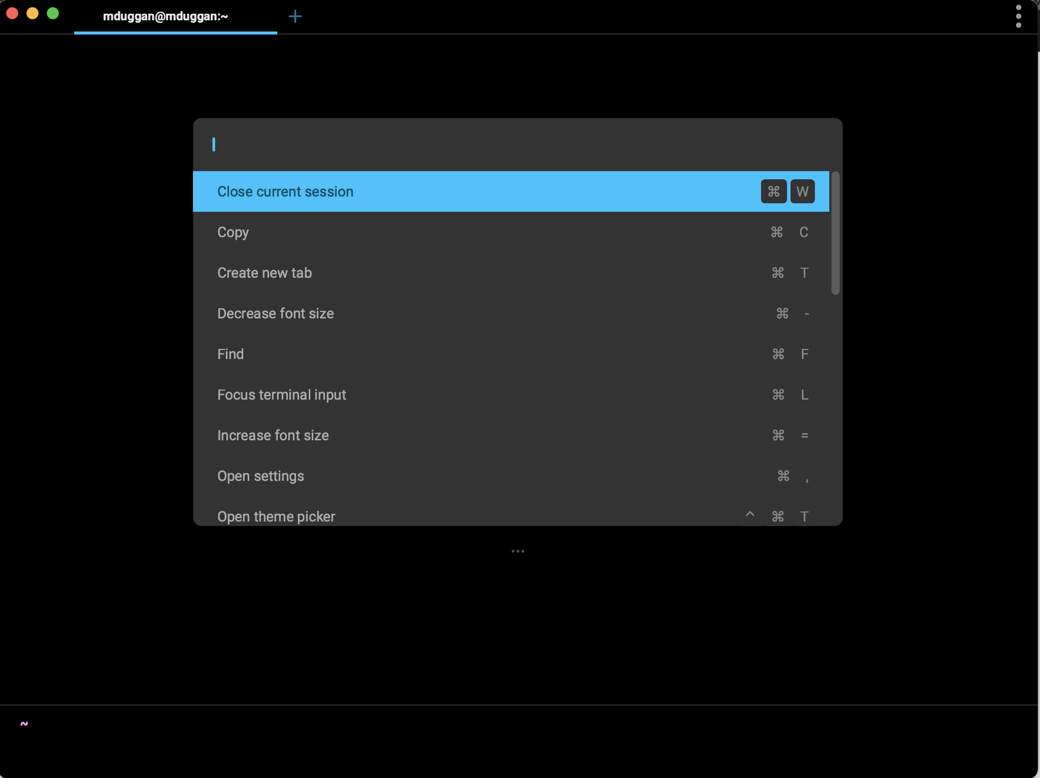
From launch it wants you to know this is not your normal terminal emulator. It is trying to get you to do things the warp way from minute 1, which is great. The Command Palette is a lightning fast dropdown of all the Warp commands you might need. Search commands is just bringing up the previous commands from your history.
Executing commands in Warp is unlike anything I've ever seen before. Every command is broken into a Block which is a total rethink of the terminal. Instead of focusing primarily on the manipulation of text, you are focused on each command run as an independent unit you can manipulate through the UI. This is me trying to show what it looks like:

You'll notice the space and blocking between each command. Clicking those 3 dots gives you this dropdown:

All this functionality is available on your local machine but they are also available on machines you SSH (if the remote host is using bash). This opens up a massive collection of power text editing functionality on remote machines that might not be configured to be used as a "development machine". Check out that list here and think of how much time this might have saved you in your life.
Sharing
I think the primary sales point of Warp is the Sharing functionality, which allows for some very interesting workflows. It appears at some point you'll be able to add things like approval before you run commands (which I think is kind of a weird anti-pattern but still I applaud the idea). Right now though you can generate links to your specific block and share them with folks.
I made an example link you can see here. However I don't know how long the links last so here is a quick screenshot.

I love this for a million uses:
- it beats sharing snippets of text in Slack all the time
- it's a game changer for folks trying to do coding meetups or teaching a class
- adding in concepts like approval or review to commands would be mind-blowing for emergency middle of the night fixes where you want a group of people to review it. It doesn't seem to have this functionality yet but appears to be coming.
Daily Usage
Alright so I love a lot of the concepts but how much do I like using it as a daily driver? Let's focus on the positive stuff on Mac. I'm testing this on a 16 inch MacBook Pro with 32 GB of RAM, so about as powerful as it gets.
Pros
- Warp is just as fast as iTerm 2, which is to say so fast I can't make it choke on anything I tried.
- Steps into an area of the market that desperately needs more options, which is the multi-platform terminal emulator space. Warp is going to eventually be on Linux, Windows and Mac which right now is something only a handful of emulators can say, the biggest being
alacritty. - All this functionality comes out of the box. No giant configuration screens to go through, this all works from launch.
- I can't stress how "baked" this software feels. Everything works pretty much like they promise every time. Even with weird setups like inside of a tmux or processing tons of text, it kept working.
- The team is open to feedback and seems to be responsive. You can see their repo here.
Cons
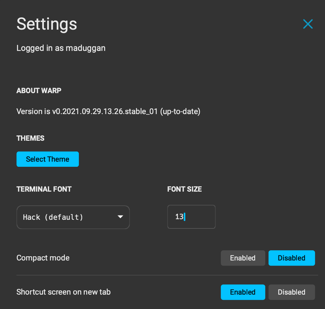
- I don't love how much space the blocks end up taking up, even with "compact mode" turned on. I often take my laptop to my balcony to work and I miss the screen real estate with Warp that I get with iTerm 2.
- Missing profiles is a bummer. I like to be able to tweak stuff per workflow.
- I'd love some concept of bookmark if I'm going to lose so much space to the "Block" concept.
- My workflow is heavily invested in tmux and Vim, meaning I already have a series of shortcuts for how to organize and search my data into distinct blocks. I can change it for Warp, but right now that would be more of a lateral move than something that gives me a lot of benefits today.
- You really don't get a lot of customization. You can change the theme to one of their 7 preset themes. In terms of fonts, you have one of 11 options. My favorite themes and fonts weren't on this list.
- I would love some documentation on how I might write a plugin for Warp. There's stuff I would love to add but I couldn't really see how I might do that.
- A lot of the game-changing stuff is still in the pipeline, things like real-time collaboration and shared environmental variables.
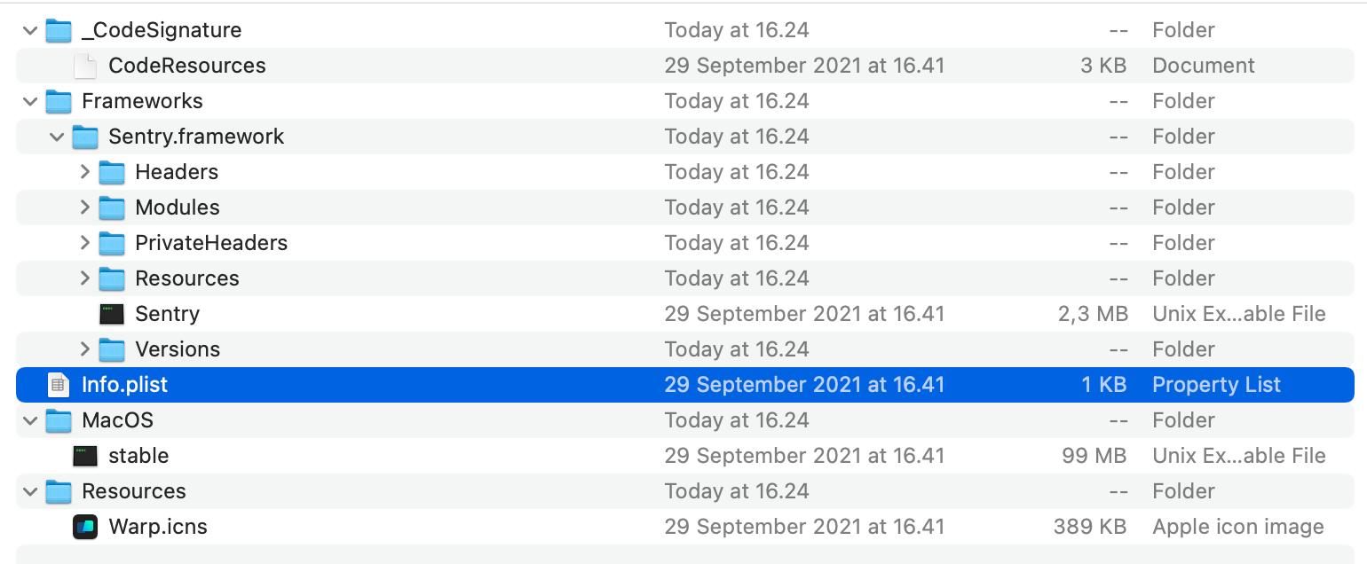
- I wish they would share a bit more about how the app works in general. Even opening up the app bundle didn't tell me a lot. I have no reason to not trust this program, but anything they would be willing to share would be appreciated.
A Rust Mac App?
I'm very curious how they managed to make a Rust GUI application on the Mac. I'd love to see if there is some Swift UI or AppKit code in there or if they managed to get it done with the referenced Rust library. If they managed to make an application that feels this snappy without having to write Swift or Objective-C, all the more credit to this team. I'd love more information on how the app is constructed and specifically how they wrote the client front-end.
This does not feel like a "Mac app" though. Immediately you'll notice the lack of Preference pane underneath the "Warp" header on the menu bar. Help is not a drop-down but a search and in general there aren't a lot of MacOS specific options in the menu bar. This likely fits with their model of a common work platform across every OS, but if feeling "Mac-like" is important to you, know this doesn't. It's just as fast as a native application, but it doesn't have the UI feel of one.
Summary
If you are just starting out on the Mac as a development machine and want to use a terminal emulator, this is maybe the fastest to start with. It comes with a lot of the quality of life improvements you normally need to install a bunch of different pieces of software for. Also if you teach or end up needing to share a lot of code as you go, this "Sharing" functionality could be a real game-changer.
However if you, like me, spend your time mostly editing large blocks of text with Vim in the terminal, you aren't going to get a ton out of Warp right now. I just don't have a workflow that is going to really benefit from most of this stuff and while I appreciate their great tab completion, most of the commands I use are muscle memory at this point and have been for years.
I wish this team all the success though and cannot stress enough how great it is to see someone actually experimenting in this space. There are great ideas here, well executed with an eye for stability and quality. I'm going to keep a close eye on this product and will definitely revisit as things like "command reviews" are added down the line.
Like this? Think I'm out of my mind? Ping me on Twitter.